


If you’ve ever experienced a space that felt amazing but you couldn’t quite put your finger on why, it’s more than likely some interior design fundamentals have been used when creating that space (…sometimes this is done consciously, but sometimes unknowingly).
Interior Design Fundamentals are some basic principles that we use in design to help elevate the space and make it more pleasing to the eye. It’s easy to overlook these details if you don’t know what you’re looking for, but once you understand them, you’ll likely see them everywhere.
Understanding these fundamentals can really help you to elevate your own designs to make them look better, feel better and give you that designer touch.
In today’s blog post, I want to talk to you about just one of the design fundamentals that I use in my designs and that is Contrast.
I’ve worked on lots of projects where the client has already built their home and they’ve reached the end point – they’ve moved in, bought new furniture and started living in the home, but were never able to get it to feel “finished”. This is often when someone like me gets called in to help “fix it”…
One of the most common reasons I find that a space is feeling flat or incomplete, is a lack of contrast in the design. So, this is one of the first things I would usually address.
Here are 4 ways that I introduce contrast into a space to make it feel more interesting, balanced and elevated :
Colour
Colour seems like the most obvious way to add some contrast into your space but often people think it’s the only way. This is where you end up making impulse purchases of brightly coloured cushions or artwork to “liven up” a space, but it doesn’t always solve the problem, and it doesn’t necessarily create the style or mood that you’re wanting to achieve.
If you’re looking to create contrast in your colour scheme, then make sure you spend the time to consider what that colour scheme is first – this will ensure that you can achieve a cohesive and balanced blend of colours throughout the space and make sure the overall palette will deliver what you’re wanting to achieve.
Textures
Introducing contrast in textures is one of my favourite tools to create more interest in a space, but it’s often overlooked by homeowners who are putting together their own schemes for their home and deciding on what materials and finishes to use.
Achieving a balanced combination of textures is especially important if you’re using a neutral palette or limited colour scheme because this is what will stop it from looking flat and lifeless.
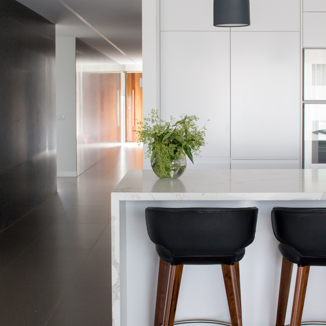
I like to mix smooth marble and polished metals with more textured organic timbers and stone and always bring in soft textiles to balance out any hard surfaces in the space.
Light/Dark
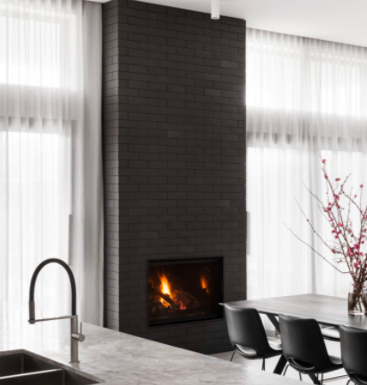
Consider playing with very dark and very light elements to create a strong contrast between surfaces.
I like to use dark furniture pieces or floorboards against crisp white walls or light artworks against dark walls.
This contrast between light and dark can also be used on a larger scale by creating rooms throughout your home that are very dark and very light, instead of everything being at the one level. It can make for a much more interesting and dramatic experience moving through the different spaces.
Shape
Try mixing up the shapes in your space.
So many of the living rooms I see are made up entirely of rectangles, from furniture to joinery, floor rugs and artwork. This can leave a space feeling very one-dimensional.
Make sure you have a mix of straight lines and curves to keep it interesting and easy on the eye.
If you do have mostly rectangles already in your space, try bringing in a round coffee table, circular mirrors or wall hangings, or round cushions to balance it out.
Why I quit my job as an interior designer
It sounds a bit dramatic I know… but hear me out. I’ve been on a long journey to figure out exactly how I can add the most value to projects I work on and I think I’ve figured it out…
Which Stone is Best for Kitchen Benchtops
Stone benchtops are one of the biggest investments you’re likely to make in your kitchen and they can also be one of the hardest-hit areas of the house.


Be the first to comment